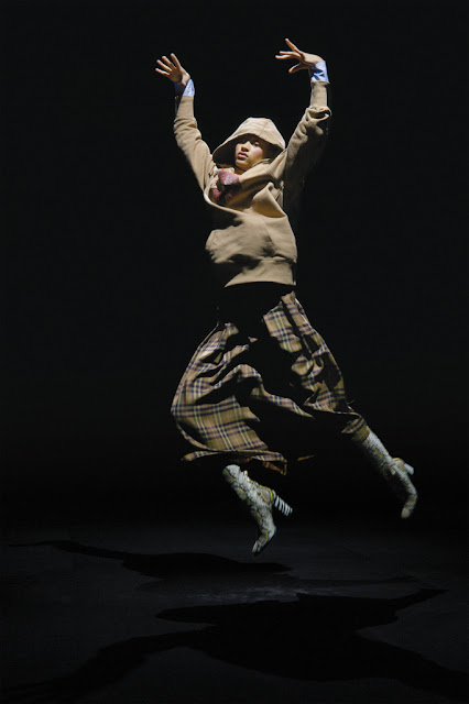
AF. Vandervost. Fall 2019 RTW – Paris Fashion Week
(Images from Vogue.com and wwd.com and the public domain. All rights. Used in promotion of the designer.)
As designers slowly begin to move away from the runway as a traditional showing for their collections, An Vandervost and Filip Arickx for the past two decades of promoting their designs, have been at the forefront of reworking the conventional setting for fashion. Probably more Avant-garde in that sense, they have maintained an evolving reconfiguration of their brand AF Vandervost to relay a more accessible appeal, projecting their ideas towards the art, movies and costume design, within the exclusivity of designer fashion. In representing their Fall 2019 collection, they teamed up with video and 3D immersive holographic photographer Stephen Sebring in creating an symbolic aspect to AF Vandervost's surreal manifestations of fashion and art.
AF Vandervost's Fall 2019 collection is, as described by the designers, is less about color, but descriptive in its movement and texture. Which is important, many younger designers get lost in color as way of individualizing their designs. Yet, at the same time, they can fall back onto an achromatic fixture, which in turn can trap an artist and fashion designer - thus its predictability. The black and white are dualities that are the same, linked, one absorbs light, the other reflects it. But, they are not colors. And it is the full spectrum which is inexhaustible in its presentation, especially via the digital world – as it can be tweaked and toned down, layered and set into new subtle tones. It actually opens up possibilities of redefining color as a medium for design.
However with the video presentation aside, the Fall 2019 collection is keeping in lock step with the evolving trends as we move into 2019. Mix and match 1990s style, thrift stores and sports and grudge looks merging. Which did occur at the tail end of the late 90s, before the 21st century when confusion reigned from all angles. Fast fashion encouraged and the en masse of expectations began in earnest. With so many newer designers pouring out of College, drawing from past resonance. Is now steeping into, borrowing from the late French Philosopher Jean Baudrillard expression, the “hyperreal”. So, maybe AF Vandervost's toning down of color is indicative of the trend of removing the early 2000 radiance of pre-collpase hope. Which, color, particularly when the internet first became what it is today, was over inundated. It wasn't real, fake, prefabricated and glossy. With the paint that has already peeled (despite, metaphorically the frantic attempts at retouching the decay), the grit and reality of Western cities returns – hence the desire of younger people searching for meaning, looking into the past for ideas, when the decline began. It all of its rustic appeal.


Comments
Post a Comment